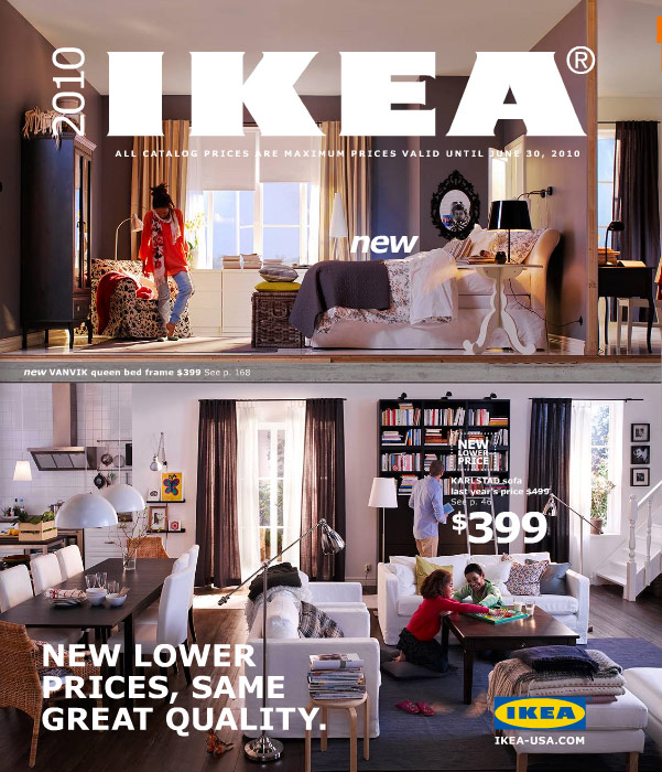
In an attempt to show their love for Microsoft, Ikea has decided to ditch Futura, its catalog typeface for 50 years, inspired by the same ideals that built the Bauhaus back in the 20’s, in exchange for Microsoft born, Verdana. A recent article in Time explains the reason for the change. According to Ikea spokeswoman Monika Gocicis, the ubiquity of Verdana makes it “more efficient and cost-effective”. Sure, we all go to Ikea for cost-effective home furnishings but without its modern European style Ikea would be just another big box store. I say be thrifty but not at the cost of style, plus I hear this whole interweb thing is just a fad anyway, so let’s not throw the baby out with the bathwater, Ikea.

